Results Page
The results page allows you to view the results for the field/scenario combinations that you simulated. You cannot review the results unless the field/scenario has been simulated. Please see simulating scenarios for more information.
Viewing the Results
To view the results on one or more field scenarios, the user may click the View Results button on the Management Scenarios page.
After clicking on View Results, the user will be directed to the Tabluar View page as a default. Users may also choose to view data in graphical view by clicking Annual-Chart or Monthly-Chart on the side navigation menu.
Tabular View
To compare the results of up to three field scenarios in the tabular view, use the drop down to select any desired initial year, then select one final year, and finally each field scenario. Click View when you are finished.
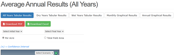
HINT: the Initial year and the Final year can be changed at anytime to view different results from the selected years, and if you only have one or two scenarios you wish to compare, select the same scenario multiple times so that there is a scenario selected for each column of the tabular display.
The user may toggle between two different units in the tabular view. The user may view results in units/acre (e.g., lbs/acre) or as total units summed across the area of the field (e.g., lbs).
After clicking View, the table will populate with the results of each scenario. Users have the option of downloading the results as a CSV file, or as a PDF file.
Interpreting Tabular Results
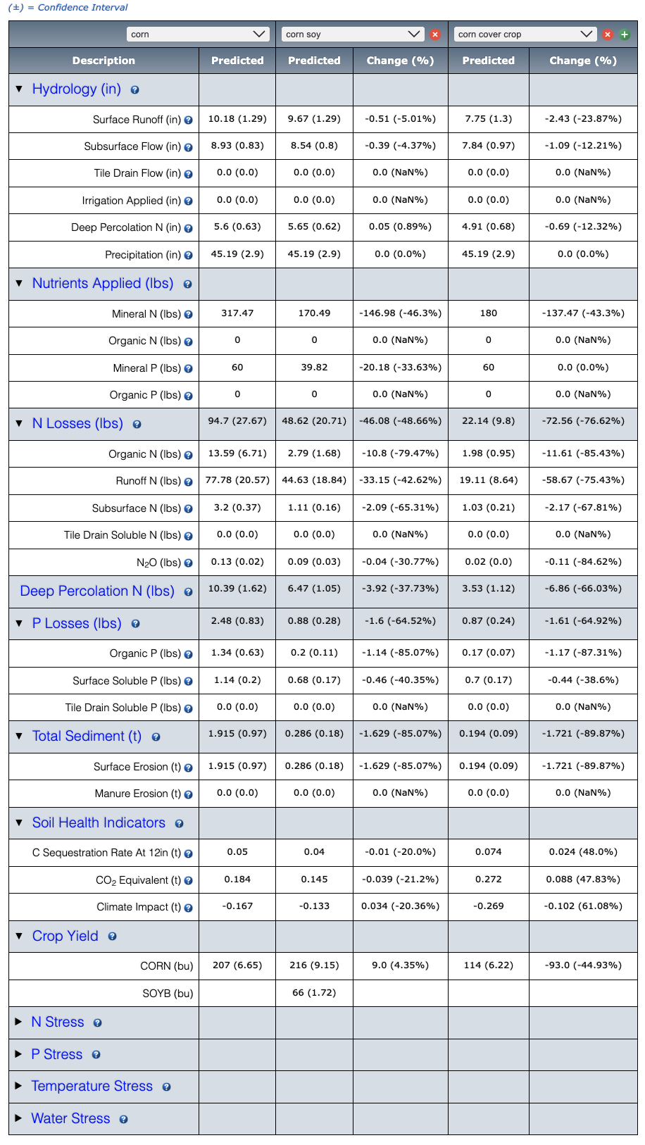
The scenario results presented in your table represent AVERAGE annual edge of field predicted across the period of simulation. NTT simulates over a period of 35 years. To view year by year results, the user can view use the Graphical results feature (See View Graphical Results.). The name of Scenario 1 will appear at the top of the first Predicted column. This column displays the nutrient, sediment and flow predicted at the edge of the field for Scenario 1 in addition to the estimated yields. Scenario 1 is the first column of data, Scenario 2 results are represented in the next column and highlighted in a different color. In addition to displaying results in the “Predicted” column, Scenario 2 also has a “Change” column that represents the change in predicted between scenario 1 and scenario 2. Scenario 3 results are also highlighted in another column. The Change column represents the change in predicted between scenario 1 and scenario 3, and so on.
NTT is designed to compare a baseline scenario (present) with an alternative scenario (future). Because of this, it is assumed that the user will be looking for improvements in the alternative scenario. This means that negative numbers in the difference and reduction % represent an undesirable result (e.g. increased predicted as compared to scenario 1) and positive numbers indicate a desired result (e.g. reduced predicted as compared to scenario 1).
Expanding Results
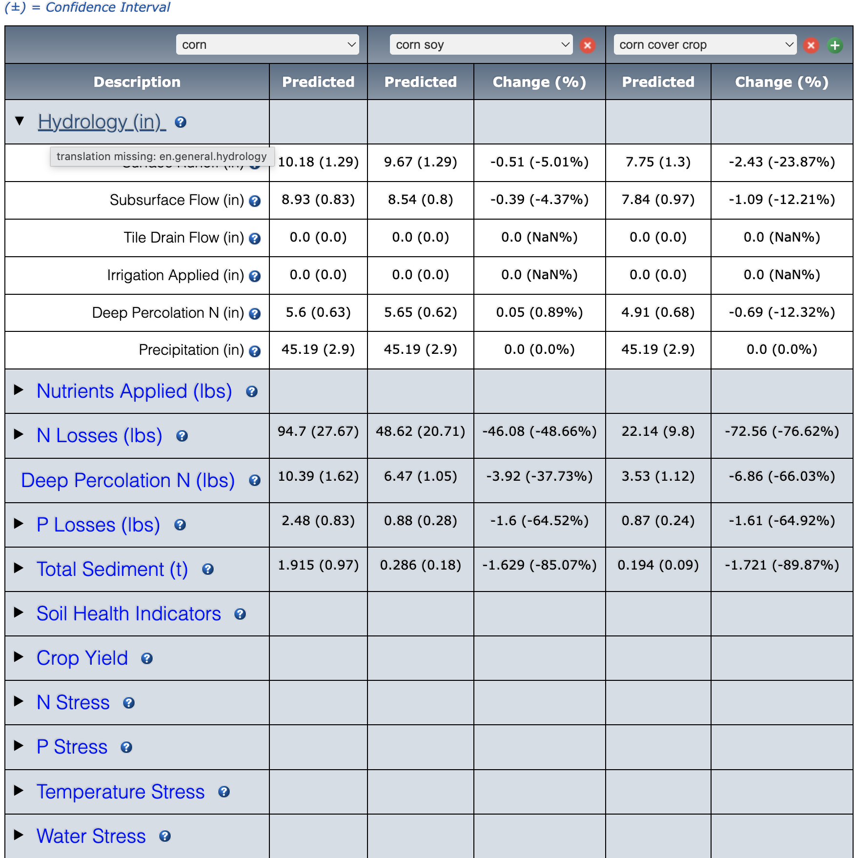
In the Tabular view, results for Total Nitrogen, Total Phosphorus, surface/subsurface & Tile Drain flow, Other Water info, Total sediment, and yield are summarized. To drill-down, click the check box next to the row of interest. For instance, when expanding the Total Nitrogen row, users will be able to view the results for Organic N, Runoff N, Subsurface N and Tile Drain N, which comprise the Total Nitrogen predicted value.
Viewing Results Graphically
In addition to being able to view your results in tabular form, NTT also provides the option of viewing results graphically. There are two graphical views for the user to select from: annual and monthly results. The user can select these views by clicking on the preferences at the top of the page.

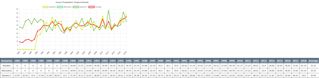
Annual Graphical Chart: Annual Charts allow users to view the annual average predicted for a specific constituent (for example flow or sediment) for the years selected for the simulation. To select the annual view, click Annual Graphical Chart button. Once this option has been selected, the user selects the scenarios they would like to compare, and the constituent they would like to view, as shown below. This will bring up the selected results on the graph. In addition to the graph, the annual results are displayed below the graph in tabular form and can also be exported.
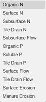
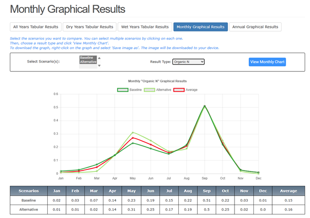
Monthly Graphical Chart: The monthly chart view allows users to view monthly averages predicted for the constituents over the period of the simulation. To view the monthly chart view, click Monthly Graphical Results from the above buttons. Monthly charts are limited to constituents that APEX summarizes monthly (see drop-down list of options below).
After selecting the result type, click on the View Monthly Chart button to view monthly results.
Dry Years Tabular Results: The Dry years chart view allows users to view the dry years averages predicted for the constituents over the period of the simulation. To view the Dry Years Results, click Dry Years Tabular Results from the above buttons
Wet Years Tabular Results: The Wet years chart view allows users to view the wet years averages predicted for the constituents over the period of the simulation. To view the Wet Years Results, click Wet Years Tabular Results from the above buttons.

Return to Table of Contents < Previous Next >